A line chart in the stock market is a graphical representation of an asset’s historical price movements over time. Line charts are created by connecting a series of data points that represent the closing prices of an asset, such as stocks, with straight lines. These charts are characterized by their simplicity, as they provide a basic and straightforward way to visualize price trends and patterns.
What is a Line Chart?
A line chart is a type of graphical representation used to display data points over a continuous interval, such as time by connecting individual data points with straight lines.
The horizontal axis (or x-axis) represents the independent variable, such as time or a sequence of events. The vertical axis (or y-axis) represents the dependent variable, which can be any numerical value or measurement that has to be tracked.
Each data point on the chart corresponds to a specific value of the dependent variable (y-axis) at a particular point in time or along the x-axis. These data points are connected with straight lines.
Such a graphical representation represents the trend or pattern in the data over the specified time frame. When viewing a line chart, one can easily follow the path of the line to see how the variable changes over time.
Let’s consider an example of a line chart representing the monthly sales of a retail store over one year.
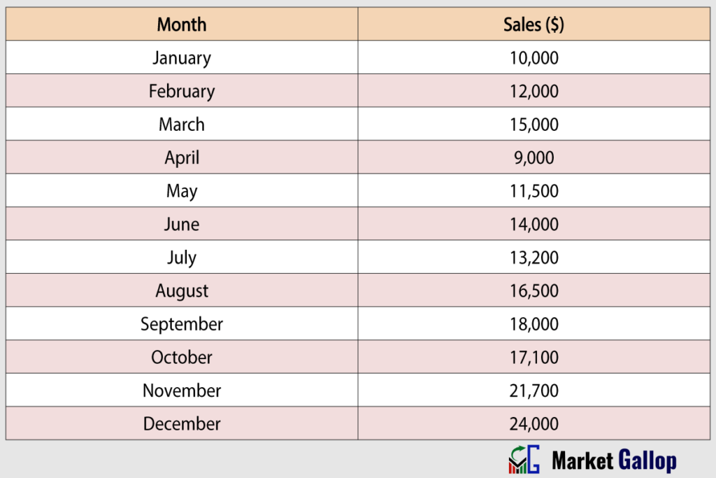
The x-axis would represent the months (January, February, March, etc.), and the y-axis would represent the total sales in dollars. In this example, each data point corresponds to the total sales for a specific month. By connecting these points with lines, a line chart can be created to visualize the trend in sales over the year.

A rising line indicates increasing sales, while a declining line suggests a decrease. It’s clear from the above graph that these charts are effective for identifying trends and making comparisons over time.
Line charts have a wide range of applications across various fields due to their simplicity and effectiveness in visualizing data trends over a time span or along a continuous interval. Such applications include financial analysis, stock market analysis, economic data analysis, sales and revenue tracking, weather data, and performance data analysis.
A line chart is one of the simplest and commonly used tools in the field of technical analysis within the stock market.
Line Charts in Stock Market
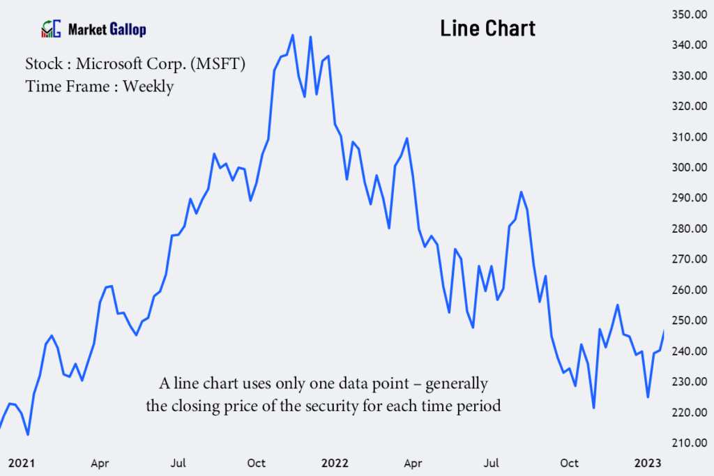
In the stock market, a line chart is a graphical representation that typically plots the closing prices of a financial instrument, such as a stock, over a specific period of time.
In a line chart, the primary data point used is the closing price for each time period. This time period can vary, depending on the chart’s timeframe – minutes, hours, days, weeks, or any other unit of time – based on the trader’s preference and analysis objectives.
Unlike Candlestick charts, Heikin Ashi charts, and Bar charts, which use four data points (Open, High, Low & Close price of the security), a line chart uses only one data point – generally the closing price of the security for each time period.
To create a line chart, a dot or marker is placed on the chart at the level of the closing price for each selected time period. Once the dots are plotted, a line is drawn to connect them, from left to right. This line visually represents the continuous flow of closing prices over the selected time periods. Each segment of the line between two data points illustrates how the closing price changed between those two specific points in time.

Let’s consider an example of a line chart depicting the closing prices of a hypothetical stock over one year.

In this example, each data point corresponds to the closing price of the stock for the particular month. By connecting these points with lines, a line chart is created. The resulting chart would display the stock’s price movements over the given time period, helping analysts and investors identify trends, reversals, and potential patterns.

The direction of the line (upward, downward, or horizontal) provides insights into the stock’s overall trend. Rising lines indicate upward price trends, falling lines suggest downward trends, and flat lines represent periods of consolidation or stability. In this particular example, when one considers the entire year, it can be observed that this stock is in an upward trend.
While closing prices are commonly used in a line chart for their significance in representing the final traded price of a stock for a specific time period, these charts can also be customized for other price metrics, such as opening, high, or low, in some charting platforms.
While line charts offer a basic view of price movements, they lack some of the details and nuances provided by more advanced chart types like candlestick charts or bar charts.
Compared to line charts, charting techniques like a bar chart and candlestick chart display more detailed information about price movements – four data points – for a particular interval of time. They allow for the visualization of opening prices, closing prices, high prices, and low prices for each time period.
On the other hand, a line chart can display only one of these four data points at a particular point in time. However, these charts are particularly effective for showing the general direction of a stock’s performance, or in other words, to display trends in the market, compared to these other charts.
Source for Signals (Price Source)
Line charts in the context of the stock market often use closing prices as data points. However, they are not strictly limited to displaying only closing prices. Many charting platforms provide options for setting other price metrics as data points.
Common price metrics that can be used as data points in line charts include:
- Closing Prices: The price of the stock at the end of a given time period.
- Opening Prices: The price of the stock at the beginning of a given time period.
- High Prices: The highest traded price of the stock during a specific time interval.
- Low Prices: The lowest traded price of the stock during a specific time interval.
- Average Prices: The average price of the stock over a given time period is calculated based on any combination of Open, High, Low, or Close prices of the asset.
• High-Low Average = (H + L) / 2
• Typical Price = (H + L + C) / 3
• OHLC Average = (O + H + L + C) / 4
How to Read Line Charts
First of all, understand the basic elements of a line chart that have already been discussed. We will now delve into how to use line charts for:
- Trend Identification
- Finding Support and Resistance Levels
- Drawing Trendlines and Channels
- Identifying Chart Patterns
Trend Identification
Uptrend
In a line chart, an uptrend is characterized by a line that slopes upward from left to right. This indicates that over the selected time period, the closing prices have generally been increasing. In some cases, the creation of higher highs and higher lows can also be observed in a line chart.
Below is a chart of JPMorgan Chase & Co. (JPM).

For the above stock, the general slope of the line from left to right is upward, indicating an upward trend for the shown period.
Downtrend
A downtrend in a line chart is depicted by a line that slopes downward from left to right. It indicates that closing prices are generally decreasing over the selected time period. In some cases, the creation of lower highs and lower lows can also be observed in a line chart.
Observe the chart below for Workday, Inc. (WDAY).

A downtrend is observed in the above chart for Workday. Take note of how the line slopes downward from left to right.
Sideways or Range-Bound
If the line in the chart appears to have minimal slope, or if the lines are moving within a certain range, it indicates a sideways or range-bound market.
In such a market, there is no clear or sustained upward or downward trend. Instead, prices fluctuate within a range, often forming a horizontal channel on the price chart.
A chart for The Travelers Companies, Inc. (TRV) is given below.

Observe the sideways movement of prices from Feb 2021. Without any clear-cut trend, the Travelers stock consistently fluctuates within this range for several months.
Trendlines and Channels
Trendlines
Traders often draw trendlines on line charts to connect the lows or highs of the price movements. An ascending trendline connects higher lows in an uptrend, while a descending trendline connects lower highs in a downtrend. These lines can help identify the slope and strength of a trend.
Observe the following chart for Boeing Company (BA).
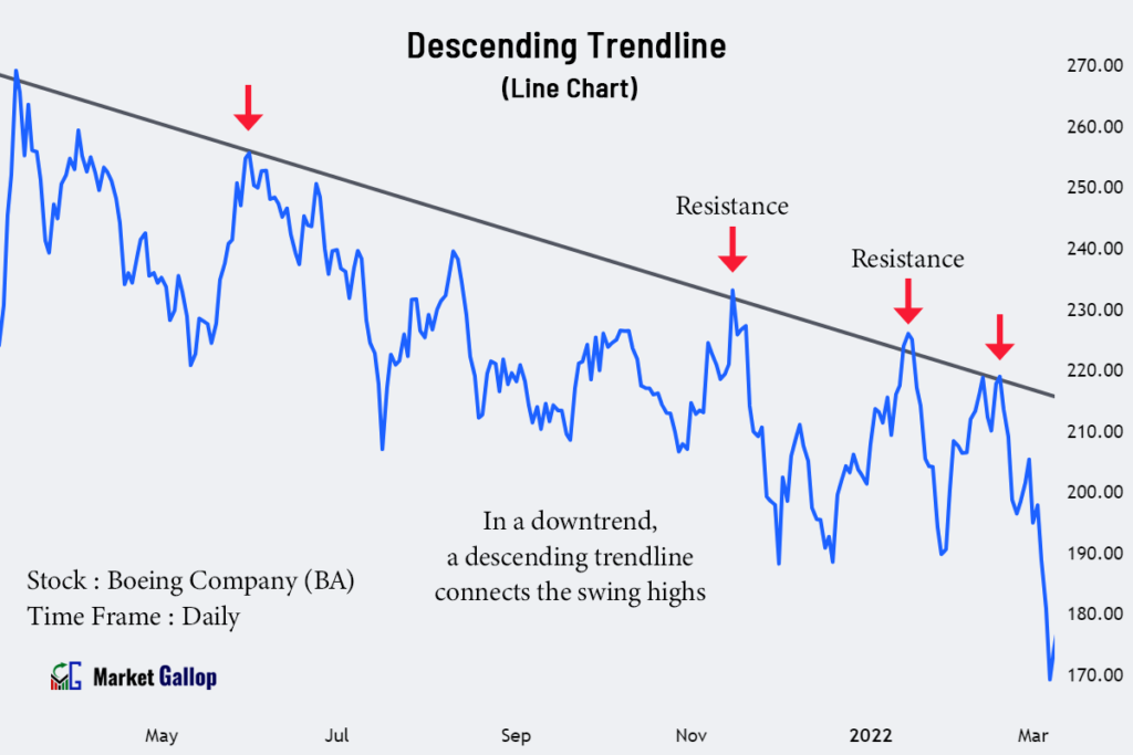
A descending trendline is drawn for the above stock by connecting the swing highs. This trendline is not violated for many months. Observe how the prices decline every time they approach the trendline from below.
Channels
Channels are formed by drawing parallel lines along the price movements on a line chart. They consist of an upper trendline that connects the highs and a lower trendline that connects the lows.
Channels can be ascending, descending, or horizontal, depending on the direction of price movement.
The following chart shows a channel pattern formed in Thomson Reuters Corp (TRI) stock.
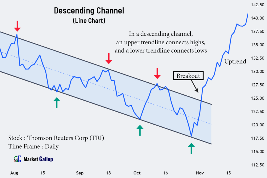
A descending channel is observed in the above stock. The upper trendline acts as resistance, while the lower trendline acts as support. The stock finally breaks above the channel in the November month.
Support and Resistance Levels
Support
Support levels represent areas where buying interest tends to increase, preventing further price declines. These levels can be identified in a line chart as price points where the lines have consistently reversed direction after reaching a low point.
The following is a chart for International Business Machines Corporation (IBM).
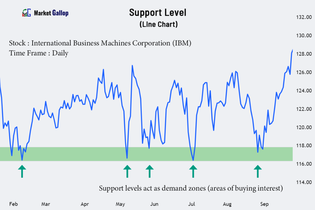
In the above chart, the $116-$118 range acts as a support zone. Observe how the prices are taking support in this zone (colored green).
Resistance
Resistance levels represent areas where selling interest intensifies, preventing further price increases. These levels can be identified as price points where the lines have consistently changed direction after reaching a high point.
Observe the following chart for Applied Materials, Inc. (AMAT).

For the above stock, the $142-$145 range acts as a resistance zone. Every time the price rises to this range, the sellers push the price lower.
Chart Patterns
A line chart is not typically the most effective tool for identifying or illustrating detailed chart patterns. They are often better visualized using more advanced chart types, like candlestick charts or bar charts. However, it is still possible to identify some of the chart patterns, though less frequently than others, in line charts.
Reversal Patterns
Sometimes, reversal chart patterns, such as head and shoulders, double tops, double bottoms, rounding tops, and bottoms, can be observed on line charts. These patterns indicate a potential reversal of the existing trend.
The following chart shows a reversal pattern formed in Netflix, Inc. (NFLX) stock.

The Netflix stock was in a prior uptrend. The stock later forms a double top pattern. When found in an uptrend, a double top formation is a bearish reversal pattern. Subsequently, the stock enters a downtrend.
Continuation Patterns
Sometimes, continuation patterns, such as cup and handle, bull flags, bear flags, bullish pennants, and bearish pennants, are also visible in line charts. These patterns indicate that the prevailing trend is likely to continue.
The following chart shows two continuation patterns formed in Home Depot, Inc. (HD) stock.

In the above chart, the first pattern shown is an ascending triangle pattern. When formed in an uptrend, this formation is a bullish continuation pattern. The pattern is validated once the price breaks above the ascending triangle.
The second pattern shown is a head and shoulders pattern. When formed in a downtrend, this formation is a bearish continuation pattern. The pattern is validated once the price breaks below the neckline of the pattern.