A bar chart in the stock market is a graphical representation of an asset’s historical price movements over a specified time period. Bar charts consist of individual bars that display four essential pieces of information for each time period: the open, high, low, and close prices of the security. Bar charts used in the stock market are also known as OHLC bar charts, and they have a different structure and objective compared to general bar charts.
What is a Bar Chart?
A bar chart (general) is a graphical representation of data using rectangular bars or columns to depict different categories or data points. It is an effective way to visually display and compare data and is hence used in various fields, including business, statistics, science, and finance.
General bar charts can be either vertical or horizontal. In a vertical bar chart, the bars extend vertically from the horizontal axis (x-axis), while in a horizontal bar chart, the bars extend horizontally from the vertical axis (y-axis).

The length or height of each bar is proportional to the value it represents. Longer bars indicate higher values, and shorter bars represent lower values.
The bar charts used in the stock market and technical analysis, also known as OHLC bar charts, are entirely different from general bar charts. The key differences include structural and other specific elements.
Bar Charts in Stock Market
In the stock market, a bar chart is a type of charting method used to represent the price movement of a security, such as a stock, over a specific time period.
Unlike the general bar charts previously discussed, bar charts in the stock market consist of numerous vertical price bars, each providing a visual representation of how the price of an asset fluctuated over a specific duration.
The inclusion of OHLC (Open, High, Low, & Close) data is a distinguishing feature of bar charts used in financial markets. This type of chart is widely used in technical analysis by traders and investors to analyze price movements and identify trends.
While bar charts have been widely used for technical analysis in the financial markets, they are often considered less popular than candlestick charts. The preference for candlestick charts is primarily rooted in their enhanced visual appeal. Although both of these charts convey the same price information, the use of candle bodies and wicks in candlestick charts makes it easier for traders to quickly grasp the relationship between open, close, high, and low prices for a given time period.

Structure of a Bar
A stock market bar chart consists of individual bars, each representing a specific time interval (e.g., an hour, day, week, or month). These bars are depicted by vertical lines extending horizontally on both sides.
Open, High, Low, and Close (OHLC) Data
Each bar consists of the following elements:
- Open Price: The horizontal line on the left side of the bar represents the opening price of the asset at the beginning of the specified time period.
- Close Price: The horizontal line on the right side of the bar represents the closing price of the asset at the end of the time period.
- High Price: The top point of the vertical bar indicates the highest price reached during that time period.
- Low Price: The bottom point of the vertical bar indicates the lowest price reached during the time period.

The height or length of each bar indicates the price range or volatility observed during a specific period. A taller or longer bar indicates a larger price range, reflecting higher volatility, while a shorter or lower bar signifies a narrower price range and lower volatility.
The position of the opening and closing prices relative to each other can provide insights into market sentiment. For example, a long bullish bar suggests strong buying pressure, while a long bearish bar indicates strong selling pressure.
Color-coding
Bar charts can be color-coded for visual clarity. For instance, bars may be colored differently to signify bullish (e.g., green) and bearish (e.g., red) periods, allowing traders to quickly interpret market sentiment.
The color and direction of the bars indicate the price movement during the time period:
- A bullish (upward) price movement is represented by a green bar, with the closing price higher than the opening price.
- A bearish (downward) price movement is depicted by a red bar, with the closing price lower than the opening price.

Basic Bar Types
Up Bar (Bullish Bar)
An up bar, also known as a bullish bar, is formed when the closing price is higher than the opening price.
Down Bar (Bearish Bar)
A down bar, also known as a bearish bar, is formed when the closing price is lower than the opening price.
Doji Bar
A Doji bar has an open and close price that is equal or nearly equal, creating a small or non-existent body. The color of a Doji bar is inconsequential.
Basic Signals of a Bar Chart
(a) Up Day
An up day occurs when the closing price is higher than the opening price.
- Look for bars where the right tick (closing price) is higher than the left tick (opening price). The vertical line extends upwards.
(b) Down Day
A down day occurs when the closing price is lower than the opening price.
- Identify bars where the right tick (closing price) is lower than the left tick (opening price). The vertical line extends downwards.
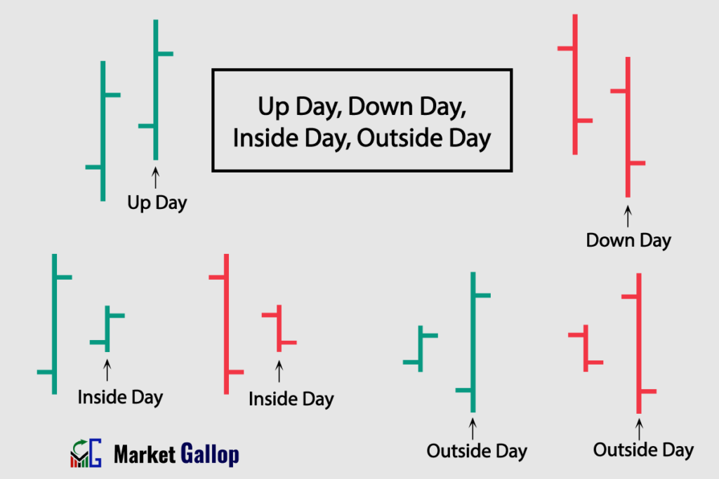
(c) Inside Day
An inside day happens when the current day’s price range is within the high and low range of the previous day.
- Look for a bar where both the high and low are within the range of the preceding day’s bar. The vertical line of the inside day bar is entirely contained within the previous day’s vertical line.
(d) Outside Day
An outside day, or an engulfing pattern, occurs when the current day’s price range exceeds the high and low range of the previous day.
- Identify a bar where both the high and low exceed the range of the previous day’s bar. The vertical line of the outside day bar extends beyond the high and low of the preceding day.
Types of Bar Charts in Stock Market
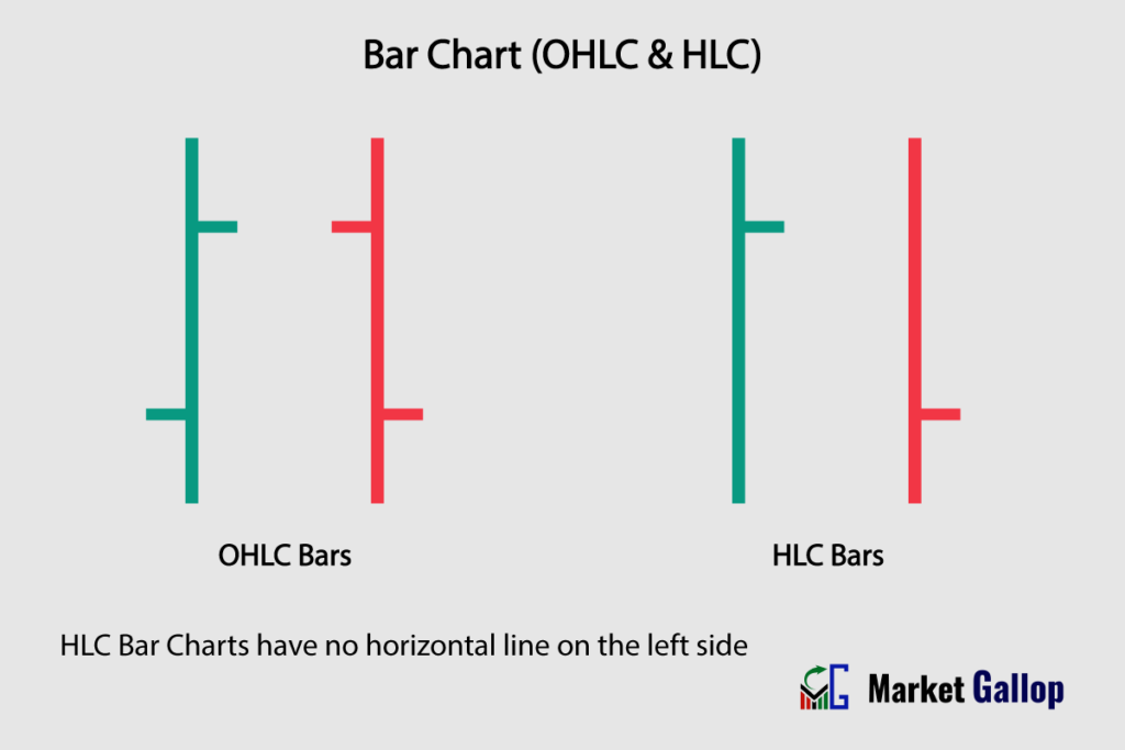
1. OHLC Bar Chart
OHLC chart displays four key prices for each time period – Open, High, Low, and Close. Each bar has a horizontal line or tick extending to the left for the opening price and to the right for the closing price.
2. HLC Bar Chart
HLC charts are similar to the OHLC chart but without the horizontal line on the left side, only showing the High, Low, and Close prices. They omit the opening price of the asset.
How to Read Bar Charts
First of all, understand the basic elements of a bar chart that have already been discussed. We will now delve into how to use bar charts for:
- Trend Identification
- Finding Support and Resistance Levels
- Drawing Trendlines and Channels
- Identifying Chart Patterns
Trend Identification
Uptrend
An uptrend is characterized by a consistent upward movement in the prices of a financial instrument over a certain period. To identify an uptrend in bar charts, look for a series of bars that create a sequence of higher highs and higher lows.
Below is a chart of Chubb Limited (CB).

An uptrend is identifiable in the above chart. Take note of how bars form higher highs and higher lows.
Downtrend
A downtrend is characterized by a consistent downward movement in the prices of a financial instrument over a certain period. To identify a downtrend, search for a series of bars that feature lower highs and lower lows.
Observe the chart below for JP Morgan Chase & Co. (JPM).
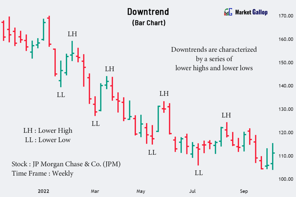
Observe the consistent formation of lower highs and lower lows in the above chart, indicating a downtrend in the stock for the shown period.
Sideways or Range-Bound
In sideways or range-bound markets, there is no clear bullish or bearish bias, and prices are moving within a certain range.
A chart for Exxon Mobil Corporation (XOM) is given below.

Observe the sideways movement of prices after a decline. Without any clear-cut trend, prices consistently fluctuate within a narrow range for several weeks.
Trendlines and Channels
Trendlines
Trendlines are drawn on bar charts to connect the lows or highs of price movements.
In an uptrend, an ascending trendline is drawn by connecting the higher lows. In a downtrend, a descending trendline connects the lower highs.
The following chart is for Visa Inc. (V).
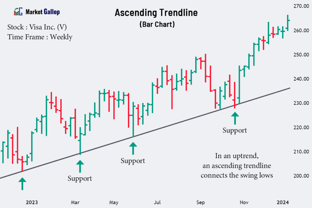
By connecting the swing lows of Visa stock, an ascending trendline is drawn. Whenever the prices approach the trendline, it takes support and bounces off it, reflecting the willingness of buyers to enter the market at that level.
Channels
Channels are formed by drawing parallel lines along the price movements in bar charts, with an upper trendline connecting the highs and a lower trendline connecting the lows.
Channels can be ascending, descending, or horizontal, depending on the direction of price movement.
The following chart is for McKesson Corporation (MCK).
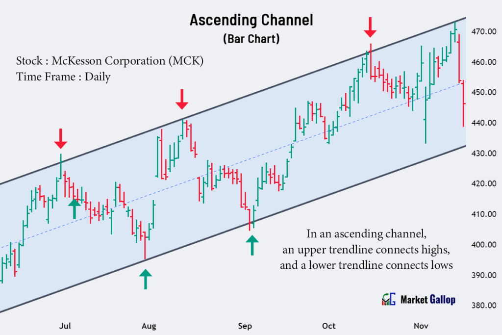
An ascending channel is observed in the McKesson stock. The upper trendline acts as resistance, while the lower trendline acts as support. The price oscillates between these trendlines, creating a well-defined channel.
Support and Resistance Levels
Support
Support levels represent areas where buying interest tends to increase, preventing further price declines. These levels can be identified in a bar chart as price points where the bars have consistently reversed direction after reaching a low point.
Observe the following chart for Qualcomm Incorporated (QCOM).
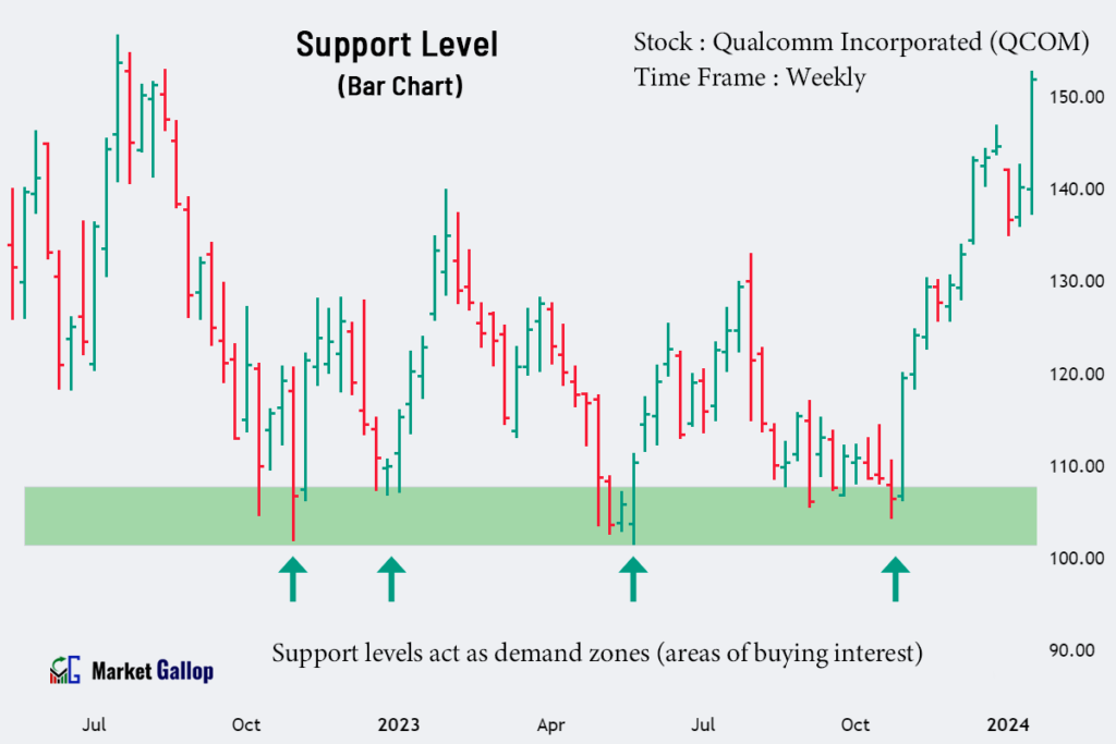
In the above chart, the $102-$108 range acts as a support zone. Every time the price drops to this range, the buyers step up and push the price higher.
Resistance
Resistance levels represent areas where selling interest intensifies, preventing further price increases. These levels can be identified as price points where the bars have consistently changed direction after reaching a high point.
Observe the behavior of price in the following chart for Humana Inc. (HUM).
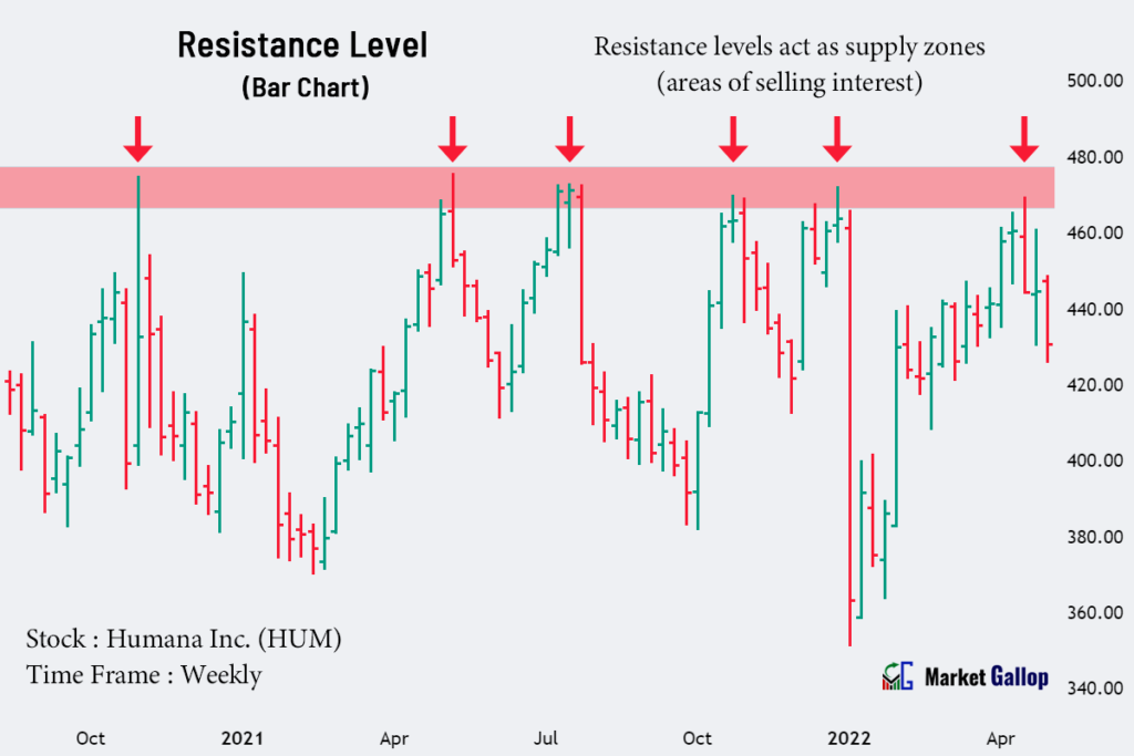
In the above chart for Humana stock, the $470-$475 range acts as a resistance zone. Every time the price rises to this range, the sellers push the price lower.
Chart Patterns
Reversal Patterns
Chart patterns, such as head and shoulders, double tops, double bottoms, rounding tops, and bottoms, can be observed on bar charts. These patterns indicate a potential trend reversal.
The following chart shows a reversal pattern formed in Broadcom Inc. (AVGO) stock.

The Broadcom stock was in a prior downtrend. The stock later forms an inverse head and shoulders pattern. When found in a downtrend, this formation is a bullish reversal pattern. The pattern is validated once the price breaks above the neckline of the formation.
Continuation Patterns
Continuation patterns, such as cup and handle, bull flags, bear flags, bullish pennants, and bearish pennants, are also visible in bar charts. These patterns indicate that the prevailing trend is likely to continue.
A bar chart for Salesforce, Inc. (CRM) is given below.
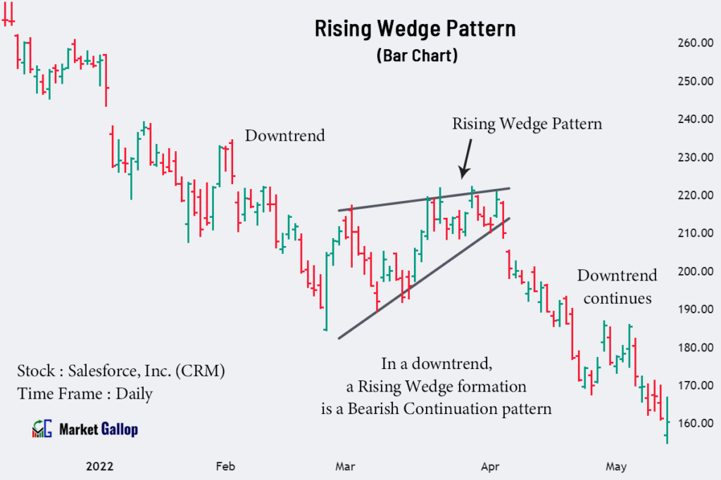
In the above chart, a rising wedge pattern is formed after an uptrend. This formation is a bearish continuation pattern when found in downtrends. The pattern is validated once the price breaks below the lower trendline of the wedge.