A Candlestick Chart is a charting technique used in the stock market to visualize price movements and trends of a security, such as a stock, over a specific time period. Candlestick charts convey information about the opening, closing, high, and low prices for each time interval. Widely employed in technical analysis to visualize and analyze price data, they provide more detailed visual information about price behavior compared to other traditional charts.
What is a Candlestick Chart?
A candlestick chart is a type of financial chart used in technical analysis that visually represents the price movement of an asset, such as stocks, currencies, commodities, or indices, over a specific time period.
The candlestick chart consists of individual candlesticks, each representing a single time interval, such as an hour, day, or week.
Each individual candle on the chart provides information about the opening, closing, high, and low prices during the designated time interval. The body of the candlestick is typically filled or hollow, and its color (commonly green or red) conveys whether the price moved up or down.

Candlestick charts were developed in the 1700s by a Japanese rice trader named Munehisa Homma. Homma used these charts to analyze the price of rice contracts in the Dojima Rice Exchange, one of the earliest futures exchanges in Osaka.
A key figure in the development of candlestick charts was Sokyu Honma, a contemporary of Homma, who further refined the candlestick techniques. The Sakata method, named after the city where Honma lived, involved analyzing price patterns to predict future price movements.
Candlestick charts remained a closely guarded secret in Japan for centuries. It wasn’t until the 1990s that Steve Nison, an American technical analyst, introduced candlestick charting to the Western world with his book “Japanese Candlestick Charting Techniques.”
Nison’s book gained widespread popularity, and traders and investors began incorporating candlestick patterns into their technical analysis methodologies. Today, candlestick charts are a standard tool in financial markets globally.
Each candlestick shows the following data:
- Open (O): The opening price of the asset during the specified time period.
- Close (C): The closing price of the asset during the specified time period.
- High (H): The highest price reached by the asset during the time period.
- Low (L): The lowest price reached by the asset during the time period.
Components of a Candlestick
A single candlestick represents the price movement during a specific time period, such as a minute, an hour, a day, or a week.
For example, in an hourly candlestick chart, each candlestick summarizes the price action over one hour. In a daily candlestick chart, each candlestick reflects the price movement within a single trading day.
Key components of a candlestick include:
- Body
- Wicks (or Shadows)
- Open and Close Prices
- High and Low Prices
- Color Coding
Body and Wicks (Shadows)
Each candlestick is defined by two fundamental components: the body and the wicks (or shadows).
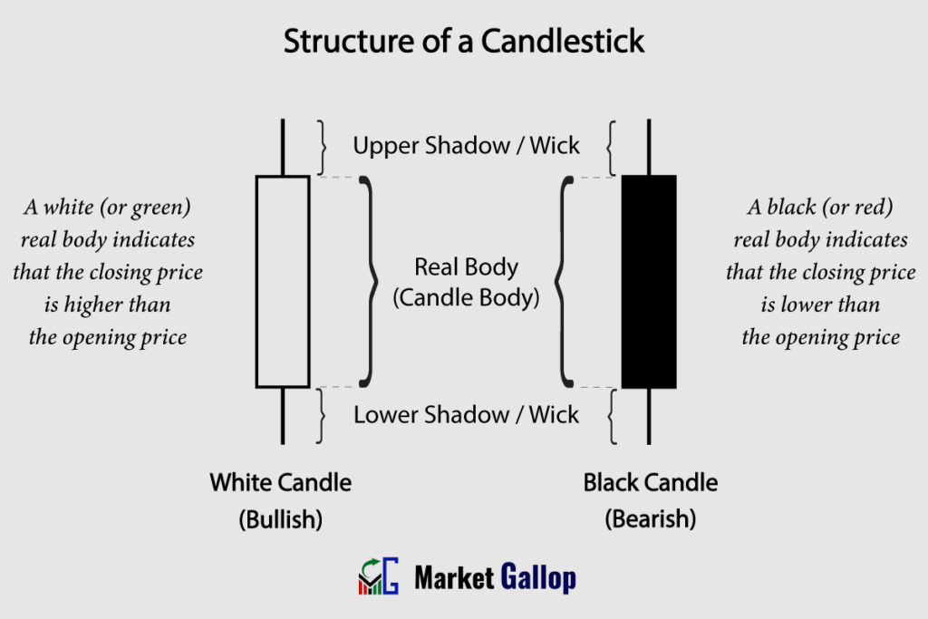
Body: The rectangular area in the middle of the candlestick represents the price range between the opening and closing prices during the time period.
Wicks or Shadows: The thin lines (called wicks or shadows) extending above and below the body represent the high and low prices reached during the time period. The upper wick extends from the top of the body to the high price, while the lower wick extends from the bottom of the body to the low price.
Open, High, Low, and Close Data
Each individual candlestick represents the open, high, low, and close (OHLC) prices for a specific time period.

Open (O): The opening price is represented by the beginning of the candlestick’s body. For a bullish (upward) candle, the open is at the bottom of the body, and for a bearish (downward) candle, it is at the top.
High (H): The highest traded price during the time period is represented by the topmost point or upper shadow of the candlestick.
Low (L): The lowest traded price during the time period is represented by the bottommost point or lower shadow of the candlestick.
Close (C): The closing price is represented by the end of the candlestick’s body. For a bullish candle, the close is at the top of the body, and for a bearish candle, it is at the bottom.
Candlestick Colors
Candlestick charts are usually color-coded for visual clarity and to indicate the direction of price movement. For instance, candlesticks are colored differently to signify bullish (e.g., green) and bearish (e.g., red) periods, allowing traders to quickly interpret market sentiment.

- Green (or White) for a Bullish Candlestick: When the closing price is higher than the opening price, the body is typically colored green or white.
- Red (or Black) for a Bearish Candlestick: When the closing price is lower than the opening price, the body is typically colored red or black.
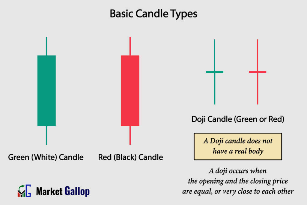
Basic Candlestick Types
There are three main types of candlesticks or candles. All other types or combinations are derived from these three.
1. Green (White) Candle
- Characterized by a white or green filled body.
- Indicates that the closing price is higher than the opening price.
- The longer the body, the stronger the bullish sentiment.
- Represents buying pressure and optimism among traders.
2. Red (Black) Candle
- Characterized by a black or red filled body.
- Indicates that the closing price is lower than the opening price.
- The longer the body, the stronger the bearish sentiment.
- Represents selling pressure and pessimism among traders.
3. Doji Candle
- Has a small or nonexistent body, with the opening and closing prices almost equal.
- Indicates market indecision or a potential reversal.
- Represents a balance between buyers and sellers, suggesting uncertainty about the future price direction.
- Can be a signal for a potential trend change if observed after a prolonged move.
How to Read Candlestick Charts
First of all, understand the basic elements of a candlestick chart that have already been discussed. We will now delve into how to use candlestick charts for:
- Trend Identification
- Finding Support and Resistance Levels
- Drawing Trendlines and Channels
- Identifying Chart Patterns
In the end, we will discuss the different candlestick patterns that provide insights into the reversal or continuation of a trend.
Trend Identification
Uptrend
An uptrend is characterized by a sustained and consistent upward movement in the prices of a financial instrument. To identify an uptrend in candlestick charts, look for a sequence of candlesticks that creates a pattern of higher highs and higher lows.
Observe the chart below for American Express Company (AXP).

Notice how the candlesticks consistently form higher highs and higher lows in the above chart, indicating an uptrend in AXP during the shown period.
Downtrend
A downtrend is characterized by a prolonged and consistent downward movement in the prices of a financial instrument. To identify a downtrend in candlestick charts, search for a sequence of candles that creates a pattern of lower highs and lower lows.
A candlestick chart for Verizon Communications Inc. (VZ) is given below.

A downtrend is observed in the above chart for Verizon. Take note of how candlesticks form lower highs and lower lows during the period.
Sideways or Range-Bound
A sideways or range-bound market refers to a market condition where the prices of a financial instrument move within a relatively narrow and horizontal range over a specific period.
In such a market, there is no clear or sustained upward or downward trend. Instead, prices fluctuate within the range, often forming a horizontal channel on the price chart.
Below is a candlestick chart of Hilton Worldwide Holdings Inc (HLT).
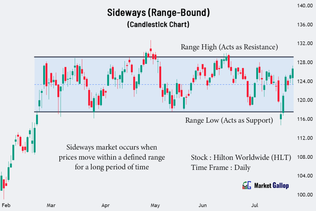
Observe the sideways movement of prices after a price surge in February. Without any clear-cut trend, the Hilton stock consistently fluctuates within a range for several months.
Trendlines and Channels
Trendlines
Trendlines are drawn on candlestick charts by connecting the lows or highs of price movements. They are used in technical analysis to illustrate the direction and strength of a price trend.
In an uptrend, an ascending trendline is drawn by connecting the swing lows. In a downtrend, a descending trendline connects the swing highs.
Observe the chart below for McDonald’s Corporation (MCD).
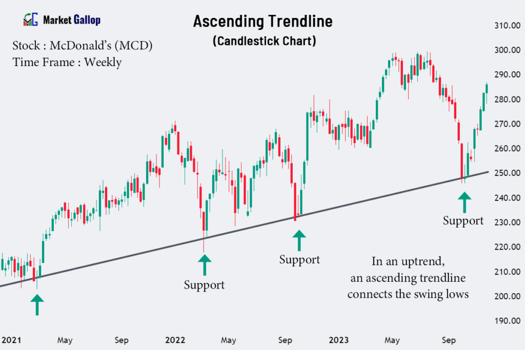
By connecting the swing lows of the above stock, an ascending trendline is drawn. It can be observed that this trendline is not violated in the subsequent years as well.
Channels
Channels are formed by drawing parallel lines along the price movements in candlestick charts. They help traders identify the trading range and potential breakout points.
Channels can be ascending, descending, or horizontal, depending on the direction of price movement. In channels, an upper trendline connects the highs, and a lower trendline connects the lows.
A candlestick chart for Marriott International (MAR) is given below.
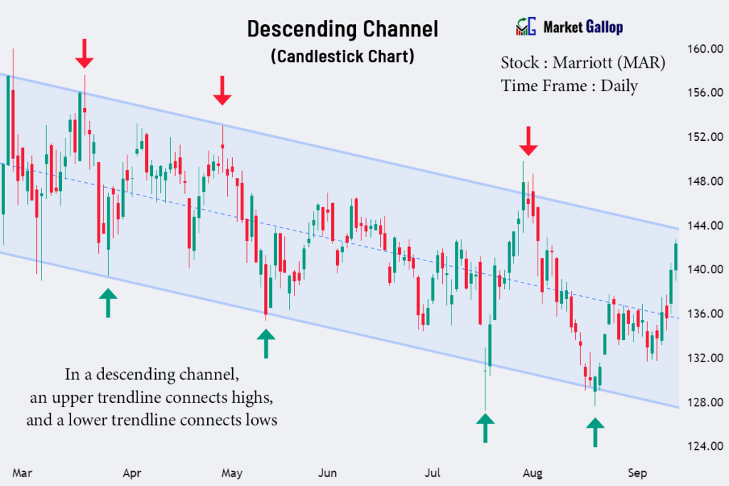
A descending channel is observed in the above Marriott stock. The upper trendline acts as resistance, while the lower trendline acts as support.
Support and Resistance Levels
Support
Support levels can be identified in a candlestick chart as price points where the candlesticks have consistently reversed direction after reaching a low point. These levels represent areas where buying interest tends to increase, preventing further price declines.
The following is a candlestick chart for ServiceNow (NOW).
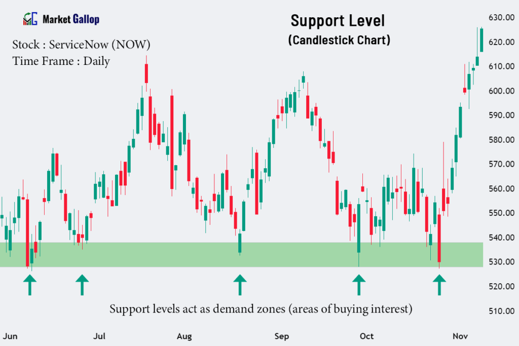
The $530-$540 range acts as a support zone for the stock in the above period. Every time the price drops to this range, the buyers step up and push the price higher.
Resistance
Resistance levels are price points where the candlesticks have consistently changed direction after reaching a high point. These levels represent areas where selling interest intensifies, preventing further price increases.
Observe the chart below for Hilton Worldwide Holdings Inc. (HLT).

Whenever the price reaches around $156, sellers push the price lower. Hilton stock finally breaches the resistance level in the November month.
Chart Patterns
Reversal Patterns
Chart patterns, such as head and shoulders, double tops, double bottoms, rounding tops, and bottoms, can be observed on candlestick charts. These patterns indicate a potential trend reversal.
A candlestick chart for The Travelers Companies, Inc. (TRV) is given below.

The Travelers stock was in a prior uptrend. The stock later forms a rounding top pattern. When found in an uptrend, a rounding top formation is a bearish reversal pattern. Subsequently, the stock enters a downtrend.
Continuation Patterns
Continuation patterns, such as cup and handle, bull flags, bear flags, bullish pennants, and bearish pennants, are also visible in candlestick charts. These patterns indicate that the prevailing trend is likely to continue.
The following candlestick chart shows a continuation pattern formed in Advanced Micro Devices (AMD) stock.

In the above chart, a falling wedge pattern is formed after an uptrend. This formation is a bullish continuation pattern when found in uptrends. The pattern is validated once the price breaks above the upper trendline in the falling wedge.
Candlestick Patterns
Candlestick patterns consist of one or more candlesticks combining to form specific formations on a price chart. Such formations provide insights into market psychology and are used to interpret and predict future price movements.
Candlestick patterns are categorized into reversal patterns (indicating a potential reversal of the existing trend) and continuation patterns (indicating a potential continuation of the existing trend).
Numerous candlestick patterns exist, and it is beyond the scope of this article to explain everything. However, some of the common candlestick patterns are listed below.
Reversal Candlestick Patterns
Some of the reversal candlestick patterns are:
- Hammer
- Hanging Man
- Inverted Hammer
- Shooting Star
- Bullish Meeting Line
- Bearish Meeting Line
- Bullish Engulfing
- Bearish Engulfing
- Piercing Line
- Dark Cloud Cover
- Tweezers Bottom
- Tweezers Top
- Bullish Harami Line
- Bearish Harami Line
- Bullish Harami Cross
- Bearish Harami Cross
- Three White Soldiers
- Three Black Crows
- Abandoned Baby Bottom
- Abandoned Baby Top
- Morning Star
- Evening Star
Continuation Candlestick Patterns
Some of the continuation candlestick patterns are:
- Bullish Separating Line
- Bearish Separating Line
- Bullish Kicking Pattern
- Bearish Kicking Pattern
- Rising Three Methods
- Falling Three Methods
- Upside Tasuki Gap
- Downside Tasuki Gap


Hello, I wish for to subscribe for this website to take newest updates, so where can i do it please help out.